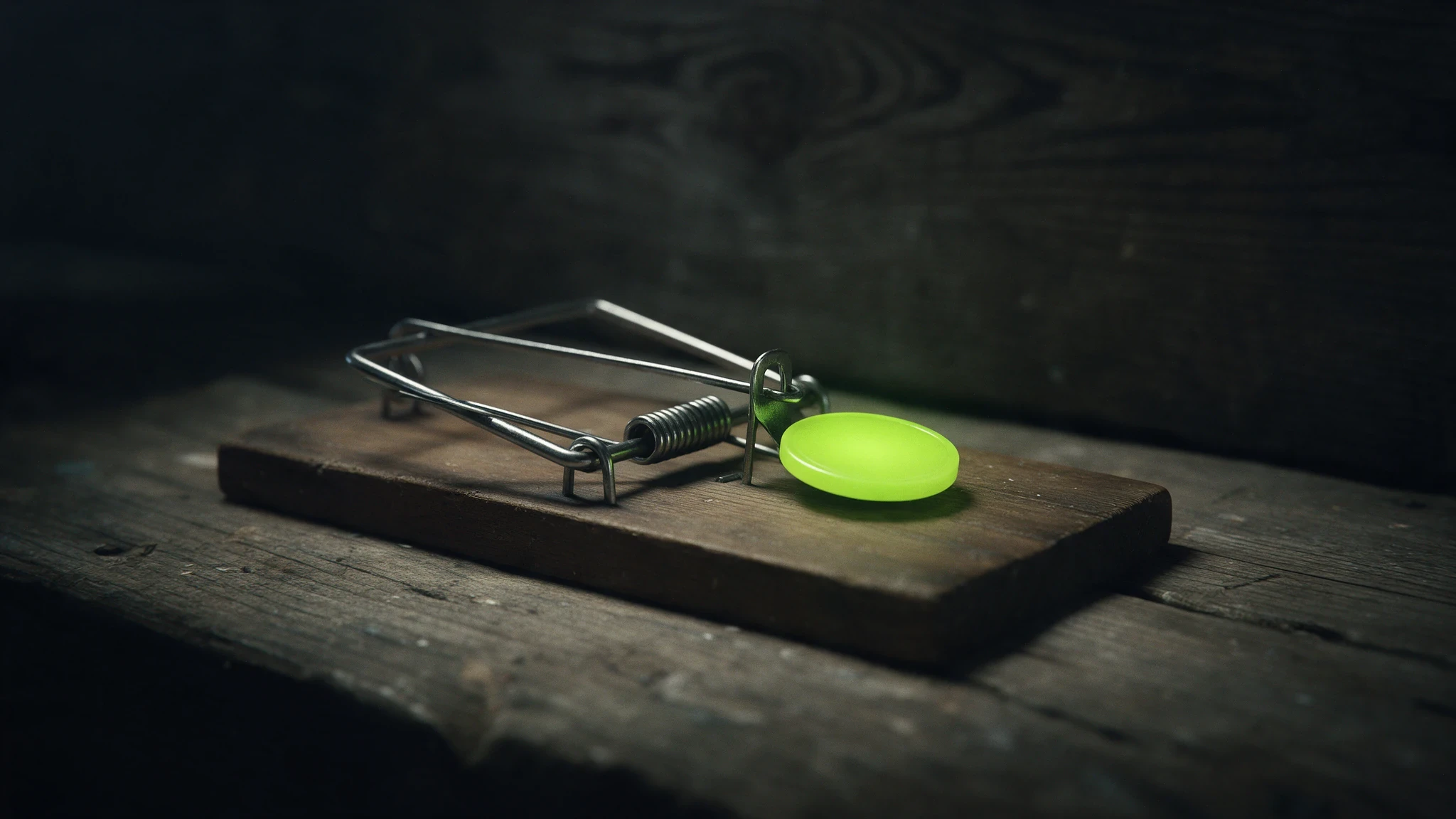
Why Beautiful Websites Still Don't Get Clients

Written by

Diego Sonoda
Designer & Business Strategist
Blending design and strategy to help brands communicate with clarity. Writes to share ideas, stay curious, and inspire others to keep building what matters.

Intro
I'll tell you the most frustrating email I get. It goes something like this: "Diego, everyone tells me the website looks amazing. My friends love it. My mum loves it. And I've had two enquiries in four months."
Beautiful, and silent. It happens more than you'd think, and it's one of the reasons I stopped leading with aesthetics when I talk to clients. Because here's the uncomfortable truth: a website looking good and a website working are two completely different achievements, and only one of them pays your rent.
The gap between the two is where most money quietly leaks out of a business. So let's talk about why the pretty ones go quiet, and what actually separates a site that gets compliments from a site that gets clients.
A beautiful website with no conversion strategy is just expensive wallpaper. Design that actually gets clients combines visual quality with clear messaging, logical structure, and obvious next steps.
1. "Beautiful" is a feeling. "Clear" is a function.
When someone says your site looks great, what they usually mean is that it feels considered. Nice type, good spacing, calm colours. That's real, and I care about it. But notice what that reaction is not. It's not "I immediately understood what you do." It's not "I knew exactly what to click." It's not "I trusted you enough to hand over my email."
Beauty makes people feel something about you. Clarity makes people do something. A site can be dripping in craft and still fail the only question a visitor is silently asking in the first few seconds: is this for me, and what happens next? If the answer isn't obvious, they don't send you an angry email. They just leave, and you never even know they were there. That's the cruel part. Bad design gets feedback. Unclear design gets silence.
2. The five-second job almost every site fails
Most people decide whether to keep reading your site in about the time it takes to read this sentence. In those five seconds, they're not admiring your grid system. They're trying to answer three questions, fast:
What is this?
Is it for someone like me?
Do I believe them?
A beautiful site that opens with something like "Crafting experiences that inspire" has just burned all five seconds and answered none of them. It sounds lovely and says nothing. Meanwhile a plainer site that opens with "We help X do Y without Z" has already won, because the visitor knows where they've landed and whether to care.
I've caught myself falling for this too. Early on, I'd write a headline because it sounded elegant, then realise a stranger reading it cold had no idea what the business actually did. Elegant and useless is still useless.
3. Beauty with no path
Here's the pattern I see most. The design is genuinely nice, but there's no journey through it. Every section is equally weighted, nothing is clearly the most important thing, and the one action you want people to take is either buried or missing entirely.
I worked with Ticked Off, and the brief wasn't "make it prettier." It was to bring strategy and structure to how the business showed up online, so the experience actually led somewhere. The managing director's words afterward stuck with me, that it delivered a genuine strategic and creative transformation with results that were immediate. That's the difference. Not a fresh coat of paint. A path that goes from "who are you" to "here's why you can trust me" to "here's the easy next step," in that order, on purpose.
And then there's the opposite pattern, which I'll keep general because I've seen versions of it many times. A business with a stunning, image-heavy site where the actual "get in touch" is a tiny link in the footer, and the contact form asks for nine fields before it lets you go. Every one of those is a small reason to give up. Beauty got them in the door. Friction walked them straight back out.
4. When beauty actively works against you
This is the part people don't expect. Sometimes the design isn't just failing to help, it's the actual obstacle. Big autoplay animations that cover the message before you can read it. Clever scroll effects that hijack the page and make people feel slightly seasick. A homepage that's so busy proving how creative the designer is that the business underneath disappears.
I've made this mistake myself, and I've said it before: I've added motion just because I could. The moment it pulls attention away from what matters, it stops being design and starts being noise. On a portfolio, maybe that's fine. On a site that needs to earn a living, it's a leak.
5. What actually gets clients (the unglamorous list)
The things that quietly do the work are rarely the things that get compliments:
A headline a stranger understands in one read.
One obvious, repeated call to action, not five competing ones.
Proof near the decision: a testimonial, a result, a recognisable name, right where doubt creeps in.
A contact step that feels like one small ask, not an interrogation.
Fast load, especially on mobile, where most of your visitors actually are.
None of that is exciting. All of it is why one site prints leads and its better-looking neighbour sits there collecting compliments.
What to look at on your own site
Open your homepage and give yourself five seconds. Then look away and answer, out loud: what does this business do, who is it for, and what did it want me to do next? If you hesitate on any of the three, the problem isn't that it needs to be prettier.
The takeaway
Beautiful is the easy part, honestly. Plenty of people can make a site look nice. The hard, valuable part is making it work: understood in seconds, trusted in a glance, and easy to act on. Get that right and beauty becomes the thing that makes a clear message feel premium, instead of a nice coat of paint over a message nobody's receiving.
If your site gets compliments but not clients, that's not a mystery, it's a diagnosis. Grab a free teardown and I'll show you exactly where people are quietly dropping off.
Frequently Asked Questions
Why isn't my well-designed website generating leads?
Visual design alone doesn't convert visitors into clients. You also need clear messaging, a page structure that guides decisions in the right order, obvious calls to action, and proof you deliver results.
What's the difference between visual design and conversion design?
Visual design makes things attractive. Conversion design makes things work — guiding visitors through a decision sequence that builds trust and ends with a specific action. The best websites do both.
Should I prioritise design or copywriting?
Copy first, always. The words do the selling; the design amplifies the message. A page with strong copy and average design will outperform a stunning page with weak copy every single time.